


With a steep rise in the growth of smartphones, the use of mobile devices to surf the web has also increased rapidly. People today have 2X more interactions with brands on mobile than anywhere else. That’s why it is important to design websites that offer the best mobile experience to users. But you must be wondering what is responsive web design? Don’t worry. In this blog, we will tell you all about it.
What is Responsive Web Design?
Responsive web design is an approach where a designer creates a website that automatically responds to the user’s preferences based on screen size, the type of device it is being viewed upon, and orientation. In such websites, the website server sends the same HTML code to all devices and Common Command Set (CCS), automatically altering the layout and design to match the device’s size and resolution.
With responsive website design, a website and its pages automatically adjust for different-sized screens and viewports to deliver the best experience to users, whether they’re on their desktop, laptop, tablet, or smartphone. For example, when viewed on a desktop computer, the website might show content in three columns; while viewing a website on the phone, users would see content shown in a single column view; a tablet might show the same content in two columns so that the content is readable and easy to navigate.
How Responsive Web Design Works
A website consists of a set of files with each web page, home page, about us page, etc. being an individual file. All these files contain HTML code and content (in the form of text and images). In a website developed by a responsive website developer, the web pages are styled with files called Cascading Style Sheets (CSS) that use various settings to serve different style properties depending on the device being used to access the site, orientation, resolution, color capability, and other characteristics of the user’s device. Such a site will look and ‘respond’ differently based on the device. For example, someone viewing a responsive site from a desktop sees a horizontally aligned navigation menu. If the same site is viewed from a mobile device, it gets a vertically aligned navigation menu with larger text that is easier to read on a smaller screen.
Why Use Responsive Web Design?
1. Google Prioritizes the Mobile Over Desktop Experience
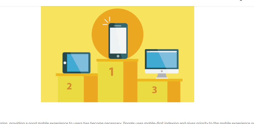
With the increase of mobile web browsing, providing a good mobile experience to users has become necessary. Google uses mobile-first indexing and gives priority to the mobile experience over the desktop. Therefore, make your website responsive if it is not already responsive.
2. Responsive Website is Required for SEO

A mobile site that loads slowly and has a design that does not adjust appropriately according to different devices negatively impacts its user experience and SEO ranking. These factors become important, considering that mobile-friendliness is an important SEO ranking factor. Your website could be buried in the search engine results pages (SERPs) simply because your design is not responsive.
3. Responsive Website Design Saves you Time

There is no doubt that you need to make your website mobile-friendly. But you may choose other options for making your website mobile-friendly than going with responsive design. One such option is creating a separate mobile version of your website.
But having two websites comes with certain issues like it will take more time to build two independent websites. You’ll be making twice the effort to create the websites and updating them over time. The chances of finding broken links or pages that do not load right also doubles. Therefore, it is better to stick with responsive websites.
4. Responsive Websites Provide Consistent Information Across Devices
People are more than willing to scroll on mobile devices almost as much as they do on desktop and are, if anything, more engaged on mobile devices and more likely to click on links. If your website responds to the user’s preferences and optimizes the content accordingly, you may be attracting your potential customers who may convert to your clients.
Takeaway
With so many people choosing online shopping over window shopping and browsing on their mobile phones for their everyday needs, responsive design becomes a must-have. You could be missing out on your potential customers, valuable leads, and your business revenue without it. To develop a responsive website, get in touch with our professional website design agency.